Branding
This is the branding for ESProfiler, containing assets that serve as the definitive blueprint for our visual identity.
The goal of this document is to provide the team with the tools and constraints necessary to create cohesive work across every platform. By adhering to these standards, we ensure that whether a user sees a social media post, an internal deck, or a product interface, they are met with a singular, unmistakable brand experience.
Logo
Composition
The ESProfiler logo is composed of two primary elements: a graphic logomark (icon) and a wordmark.
- Logomark: A stylized, abstract diamond shape incorporating layers and negative space.
- The Wordmark: A custom sans-serif typeface split into "ES" (Purple) and "PROFILER" (Navy/Silver)
Variations
The horizontal version is preferred. Use the vertical version only when space constraints make the horizontal choice an awkward fit.
Horizontal
Vertical
Usage & Backgrounds
Do not alter the order, distance, or proportion of the elements.
Light Background

Dark/Coloured Background

Typography
Platform & Digital
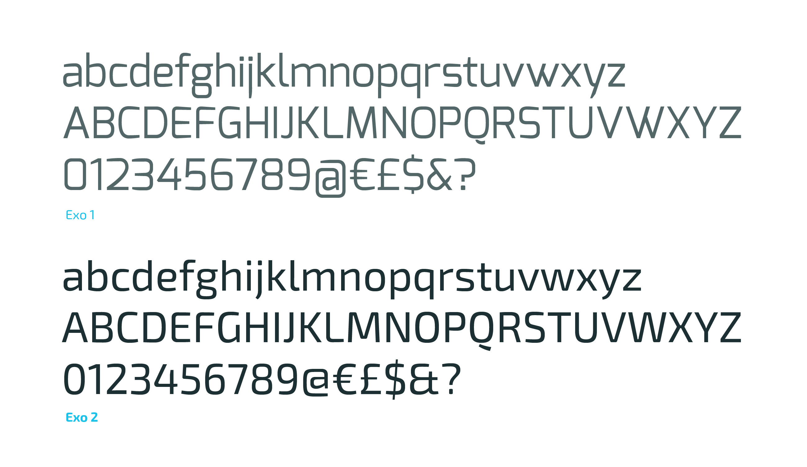
For internal applications, we utilize the Exo family. For public-facing assets, we follow the display and body guidelines below.
Other
These fonts are used on our website and for general communications.
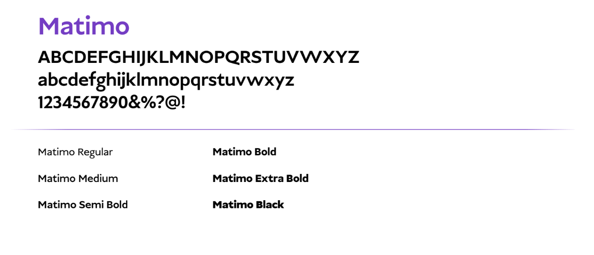
Headings and Subheadings
We use Matimo font-family for headings & sub-heading.
Body
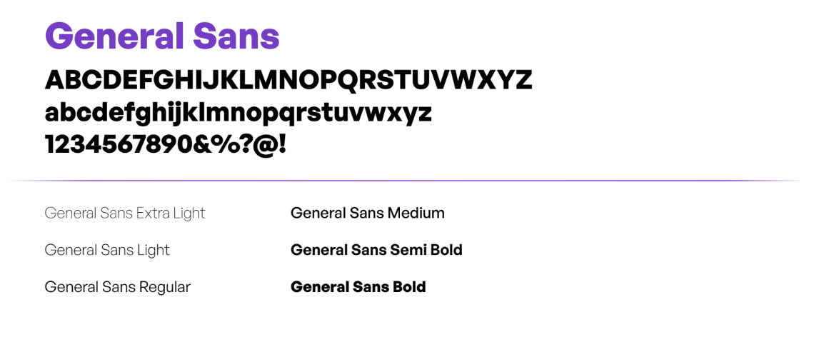
For primary text, communication and long-form text we use General Sans
Colour Palette
The palette consists of Primary, Secondary, and Highlight colors. Primary colors define the brand identity, while Highlight colors are reserved for calls-to-action.
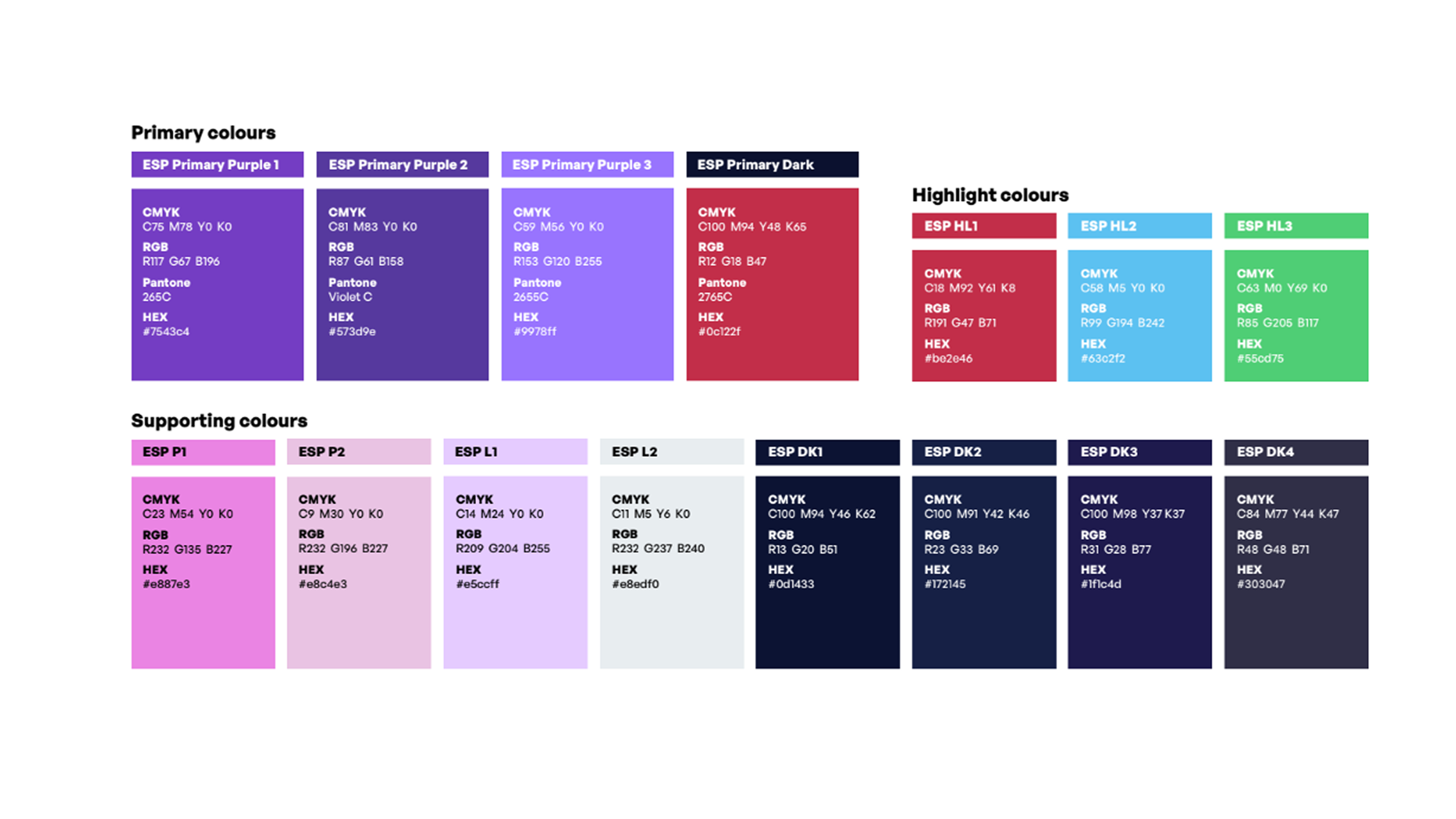
Technical Note: PANTONE to CMYK/RGB translations may vary. Always test for print clarity.
Iconography
We use the Tabler Icons library. Maintain consistent stroke weights for a unified look.
- Sizing: 16px | 20px | 24px | 28px
Visual Assets
Gradient Background
Variant 01

Colors used in the gradient include:
Variant 02

Colors used in the gradient include:
